You’ve seen them a thousand times—on chip bags, ice cream tubs, ketchup bottles, and fast-food wrappers. But did you know that some of the most iconic food logos are hiding clever, quirky, and even heartwarming secrets in plain sight? From sneaky shapes tucked into letters to nods to founders’ personal stories, these subtle design choices add a surprising layer of meaning to everyday brands. Whether it’s a hidden kiss, a sly sun, or a tribute to mom, these logos have more going on than meets the eye. Get ready to look twice—these 17 food logos are full of secrets you’ll never unsee.
1. Friendly Faces in Tostitos
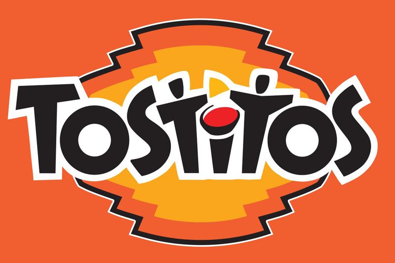
Those two T’s in the middle of the Tostitos logo aren’t just letters – they’re actually two people sharing chips! Look closely and you’ll see they’re dipping into a bowl of salsa, represented by the dot above the ‘i’.
This clever design brilliantly captures the brand’s core message: bringing people together through snacking. The logo subtly reinforces that Tostitos aren’t just for solo munching but for social gatherings and shared moments.
Next time you grab a bag for your party, appreciate how the packaging itself celebrates the very connection it aims to create between friends and family around the snack table.
2. Nestlé’s Nurturing Bird Family
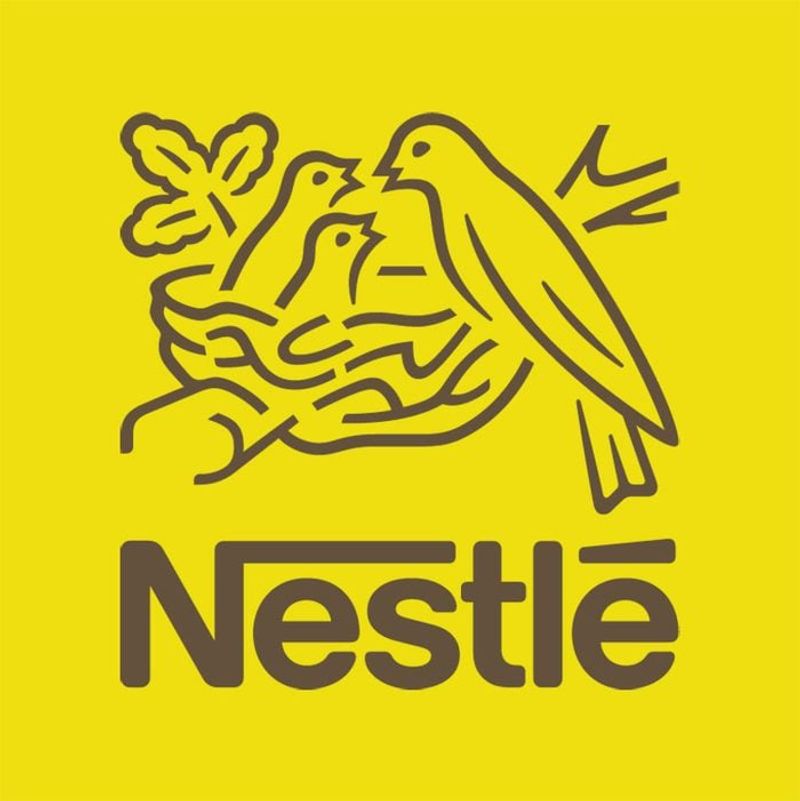
The Nestlé logo tells a heartwarming story through its bird imagery. What appears to be a simple nest with birds is actually a mother bird feeding her hungry chicks – a perfect symbol for a company whose name literally means “little nest” in German.
Founded in 1866 by Henri Nestlé, who originally created infant formula to save a neighbor’s child, this logo beautifully reflects the company’s founding mission of nourishment and care. The nest imagery connects directly to Henri’s own family crest, which featured birds in a nest.
This nurturing symbol has remained at the heart of the brand for over 150 years, subtly reminding consumers of the company’s family-focused origins.
3. Baskin-Robbins’ Secret Number
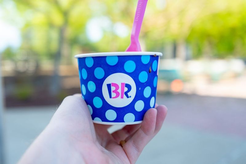
Spotted the hidden “31” in the Baskin-Robbins logo yet? The pink portions of the “B” and “R” cleverly form this number, representing the brand’s famous “31 flavors” concept – offering a different ice cream flavor for each day of the month.
When founders Burt Baskin and Irv Robbins revolutionized the ice cream industry in 1945, they wanted to move beyond the traditional chocolate, vanilla, and strawberry offerings. Their “31 flavors” promise became central to their identity, encouraging customers to try something new with each visit.
The logo redesign in 2005 brilliantly incorporated this founding principle, turning their initials into a colorful reminder of their diverse flavor commitment.
4. Duncan Hines’ Cookbook Tribute
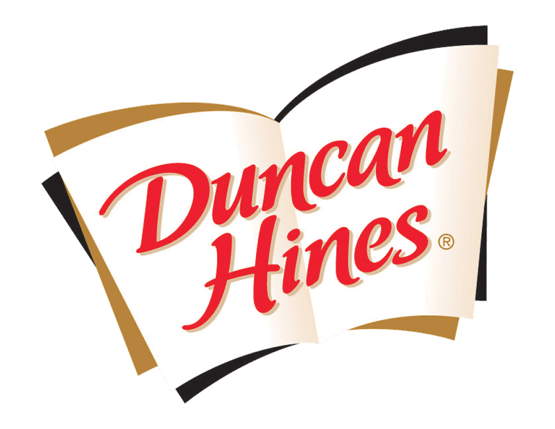
Long before Duncan Hines became synonymous with cake mixes, the real Mr. Hines was America’s original food critic. The white base of the Duncan Hines logo subtly forms the bottom of an open book – a clever nod to Hines’ famous restaurant guidebook “Adventures in Good Eating” published in 1936.
This guidebook helped travelers find quality restaurants across America during a time when highway dining was unreliable. The success of his recommendations led to the food products bearing his name today.
Few people realize their chocolate cake mix connects to a literary legacy that fundamentally changed how Americans dined out in the mid-20th century.
5. McDonald’s Maternal Arches
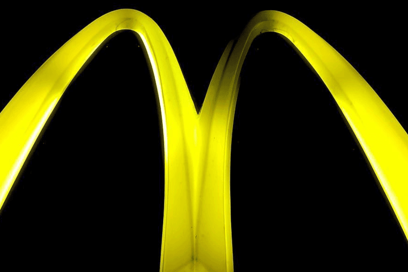
McDonald’s golden arches are more than just an “M” for the company name. In the 1960s, design consultant Louis Cheskin convinced the company to keep the arches, arguing they had a powerful subliminal effect on customers.
According to Cheskin’s research, the rounded shape symbolized maternal nourishment, resembling a nurturing pair of breasts. This Freudian interpretation suggested the logo triggered unconscious associations with comfort and motherly care.
While McDonald’s has never officially acknowledged this psychological theory, the arches have become one of the world’s most recognized symbols, working on multiple levels to create positive associations with the fast-food giant.
6. Eclipse Gum’s Cosmic Freshness
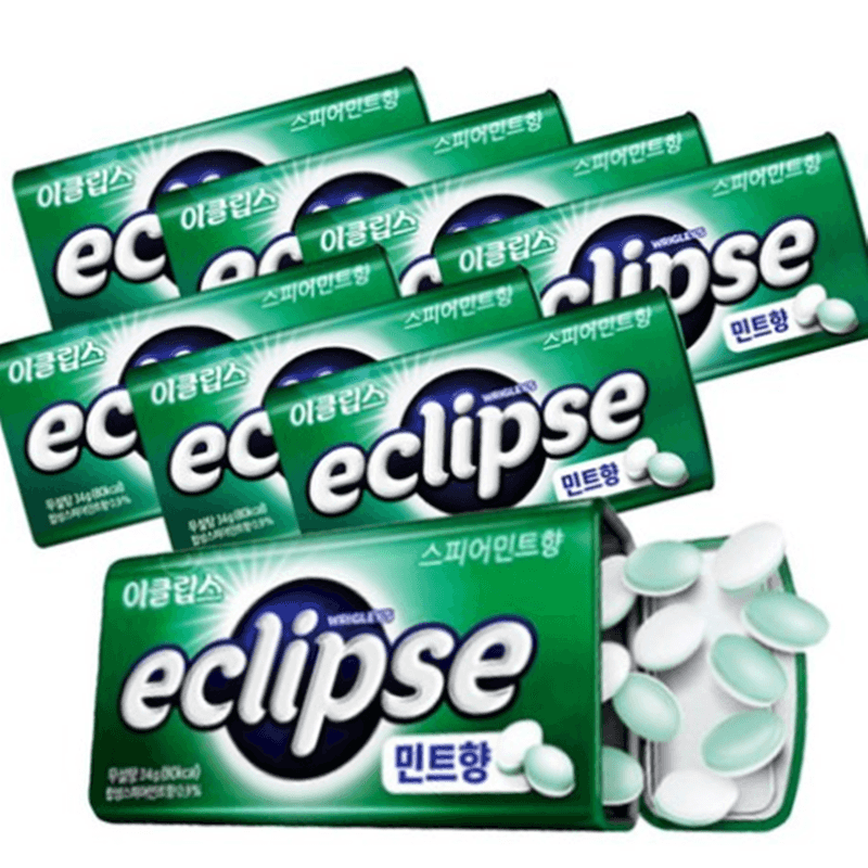
The circular design of Eclipse gum’s logo isn’t just a simple shape – it’s a visual representation of a solar eclipse. Notice how the dark and light sides create the impression of a celestial body passing in front of another, casting a shadow.
This astronomical imagery perfectly aligns with the brand’s promise to “eclipse” bad breath with freshness. The name itself suggests something powerful enough to block out something undesirable, just as the moon blocks the sun during an eclipse.
Wrigley (now Mars Wrigley) introduced Eclipse in 1999, strategically choosing this cosmic phenomenon as a metaphor for how their product would overshadow competitors in the breath-freshening category.
7. Twix’s Tiny Treat Twins
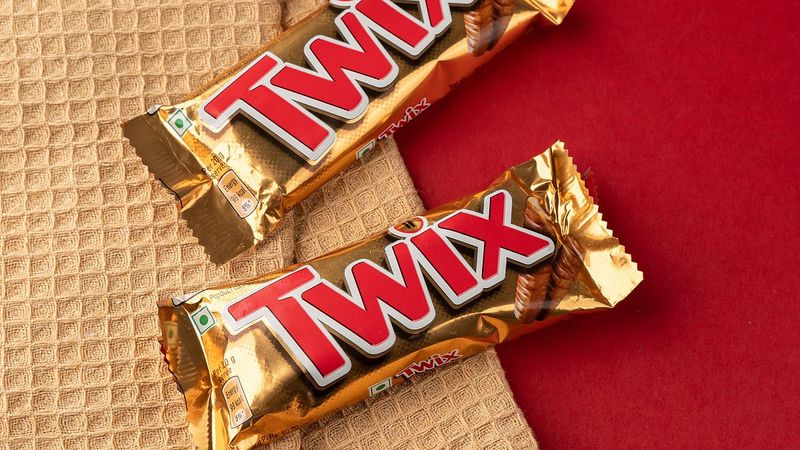
Sharp-eyed candy lovers might spot something peculiar in the Twix logo – there are actually two miniature Twix bars hiding in plain sight! The dot above the “i” cleverly contains tiny twin bars, reinforcing the brand’s famous “left Twix vs. right Twix” campaign.
This subtle design element brilliantly supports the candy’s unique selling proposition as the chocolate bar that comes in identical pairs. Mars introduced this playful marketing concept in 2012, pretending the bars came from rival factories with slightly different processes.
The campaign created a fun, fictional rivalry that encouraged consumers to pick sides while ultimately doubling down on the product’s defining characteristic – you always get two bars in one package.
8. Orbit Gum’s Day-Night Cycle
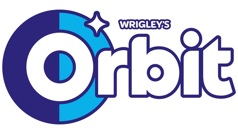
Look carefully at Orbit gum’s logo and you’ll notice the “O” isn’t a simple circle – it’s split into contrasting light and dark halves. This design cleverly represents the day-night cycle we experience as Earth orbits the sun.
The split symbolism reinforces the brand name while suggesting the gum works around the clock to keep breath fresh. Wrigley introduced Orbit in the UK in 1977 before bringing it to the US in 2001, where it quickly became a leading sugar-free gum.
The astronomical reference in both name and logo creates a sense of scientific credibility, subtly suggesting the product’s effectiveness is as reliable as the planet’s rotation – a cosmic promise of consistent freshness.
9. Wendy’s Collar Spells Mom
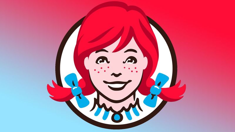
Fans of subliminal messaging point to something unusual in Wendy’s logo – the ruffled collar around Wendy’s neck appears to spell out “MOM.” This subtle detail supposedly creates a homey, comforting association with the fast-food chain.
While Wendy’s has officially denied any intentional hidden message, the resemblance is striking once pointed out. The company was founded by Dave Thomas in 1969 and named after his daughter Wendy, emphasizing family connections from the start.
Whether deliberate or coincidental, this “mom” message aligns perfectly with Wendy’s brand positioning as offering homestyle quality that surpasses typical fast food – the kind of meals mom would make.
10. Toblerone’s Bern Bear
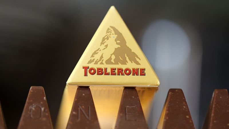
Toblerone’s distinctive triangular chocolate has featured the Matterhorn mountain on its packaging since 1970, but there’s a hidden animal waiting to be discovered! Look closely at the mountain silhouette and you’ll spot the outline of a bear standing on its hind legs.
This isn’t random – it’s a tribute to Bern, Switzerland, where Theodor Tobler created the chocolate in 1908. Bern is known as the “City of Bears,” featuring the animals on its coat of arms and maintaining a famous bear pit tourist attraction since the 1500s.
Once you see the bear, you can’t unsee it – a clever geographic Easter egg that connects the chocolate to its Swiss heritage.
11. Burger King’s Edible Typography
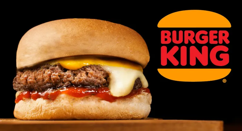
Burger King’s logo serves up more than just a name – it’s actually a visual representation of their signature product! The company name sits sandwiched between two golden, rounded halves that mimic hamburger buns, essentially turning the entire logo into a burger.
This clever design approach, known as “literal branding,” leaves no question about what the company serves. The logo underwent a major redesign in 1999 that tilted the bun elements and added a blue swirl, but returned to a more classic look in 2021.
The current design maintains the burger visual while adopting a warmer color palette that evokes the flame-grilling process that distinguishes their cooking method from competitors.
12. Heinz’s Lucky Number Combo
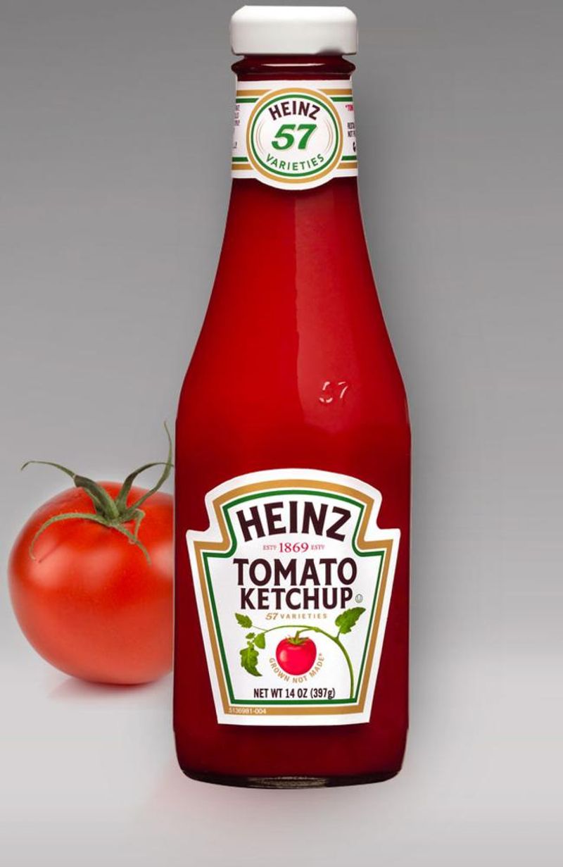
The famous “57 varieties” slogan on Heinz products isn’t actually based on their product count. When Henry J. Heinz launched this tagline in 1896, the company already produced more than 60 different items!
The number came from combining two lucky numbers – Heinz considered 5 his personal lucky number, while his wife favored 7. Together they created “57,” a marketing masterstroke that has endured for over 125 years.
Inspired by an advertisement for “21 styles of shoes,” Heinz recognized the power of specific numbers in advertising. This personal touch became one of history’s most successful marketing devices, remaining on products long after the company expanded to thousands of varieties.
13. Lay’s Sunny Disposition
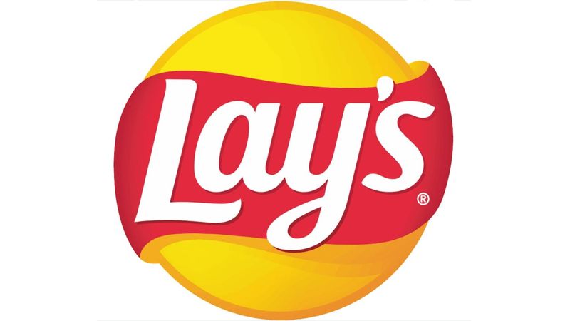
That bright yellow circle behind the Lay’s logo isn’t just a random background element – it’s actually a sun! This sunny design choice deliberately evokes feelings of summer fun, outdoor gatherings, and carefree snacking occasions.
The sun imagery aligns perfectly with Lay’s marketing campaigns that frequently feature outdoor settings like picnics, beaches, and barbecues. It’s a subtle psychological trigger that associates their potato chips with good times and warm memories.
Interestingly, this solar symbolism also connects to the product itself – potatoes grow in sunny fields, and the chips are made with sunflower or corn oils. The logo literally shines with multiple layers of brand-relevant meaning.
14. Chick-fil-A’s Poultry Profile
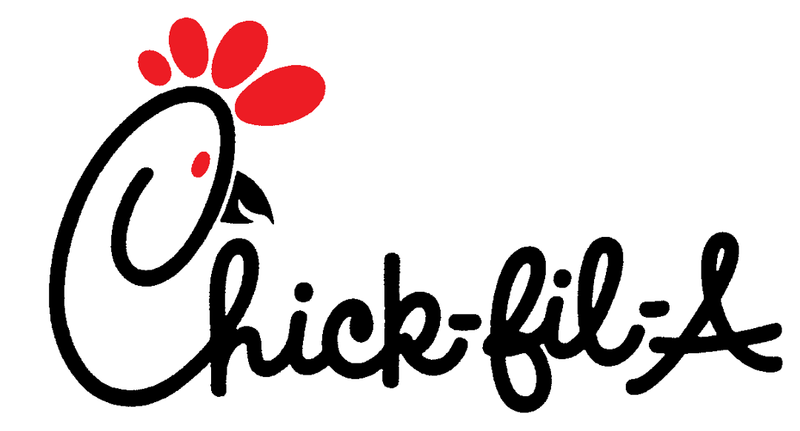
The Chick-fil-A logo contains a clever visual pun that most customers miss – the “C” in the logo doubles as a chicken’s profile! Tilt your head slightly and you’ll see the letter forms a chicken’s head, complete with a beak, eye, and comb.
This playful design element has been part of the logo since 1967, when founder Truett Cathy needed a symbol that instantly communicated what his restaurant served. The red color further reinforces the connection to a chicken’s comb.
Unlike many modern corporate logos that undergo frequent redesigns, Chick-fil-A has maintained this basic design for over 50 years, allowing the subtle chicken motif to become an enduring part of their brand identity.
15. Cornetto’s Sweet Visual Pun
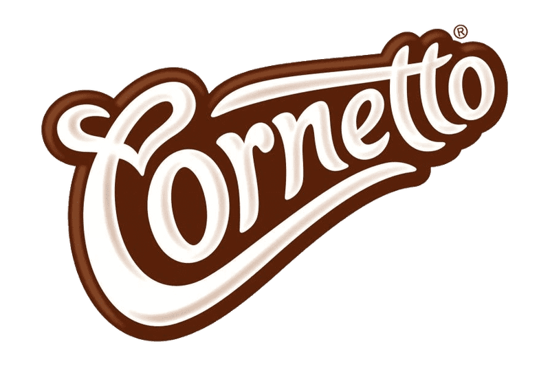
Cornetto ice cream’s logo transforms from simple text into something much more delicious when viewed from a different angle. Tilt the logo sideways and suddenly the stylized lettering reveals itself as the outline of an ice cream cone!
This ingenious visual pun works on multiple levels – “cornetto” means “little horn” in Italian, referring both to the cone shape and the musical instrument. The logo’s flowing script mimics the swirled ice cream while forming the cone shape when rotated.
Unilever’s Wall’s/Algida brand (depending on which country you’re in) has used this clever design to ensure consumers instantly recognize the product’s distinctive shape, even before they see the actual ice cream.
16. Subway’s Directional Signals
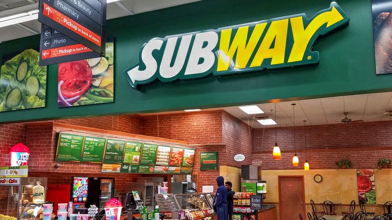
The Subway logo contains a transportation-themed secret hiding in plain sight. Notice the arrows pointing outward on the first and last letters of the word? They’re not just decorative flourishes!
These arrows on the “S” and “Y” symbolize the entrances and exits of actual subway stations, cleverly connecting the sandwich chain’s name to real underground transit systems. This design element subtly reinforces the brand’s emphasis on quick service and efficient movement.
Introduced during a 2002 redesign, these directional signals also suggest the idea of getting in and out quickly – perfect for a fast-food chain that prides itself on freshly made, customized sandwiches prepared right before customers’ eyes.
17. Hershey’s Kisses’ Sweet Surprise
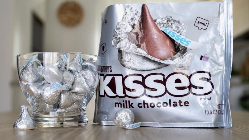
The Hershey’s Kisses logo contains a sweet secret that most chocolate lovers miss entirely. Take a closer look at the space between the “K” and “I” in the word “KISSES” – there’s a sideways Hershey’s Kiss hidden in the negative space!
This clever use of negative space creates a visual treat that reinforces the product name in a subtle, playful way. Hershey’s introduced their iconic teardrop-shaped chocolates in 1907, wrapping each in distinctive foil with a paper plume extending from the top.
Milton Hershey never explained why he named them “Kisses,” but popular theories suggest the name came from the kissing sound the chocolate makes during manufacturing or the idea that they’re as small and sweet as a kiss.
Leave a comment